

How to do Storytelling with Data - 7 Important & Surprising Lessons
- Kralingen

- Apr 15
- 9 min read
There are moments in life when it is crucial to convince people of the value of your data. It could be life saving information, or pivotal to the financial health of a business or central to a great number of people, the only way to free crucial shipping lanes in times of crisis, and even unmissable on a worldwide scale. In those cases, the story around your data needs to be superb. Yet often, people don't feel like storytelling and data-communications go hand in hand. There are plenty of negative dogma's and paradigms around good ol' boring data... which today, we are all going to break. And it starts with sports...
Scoring goals... with data
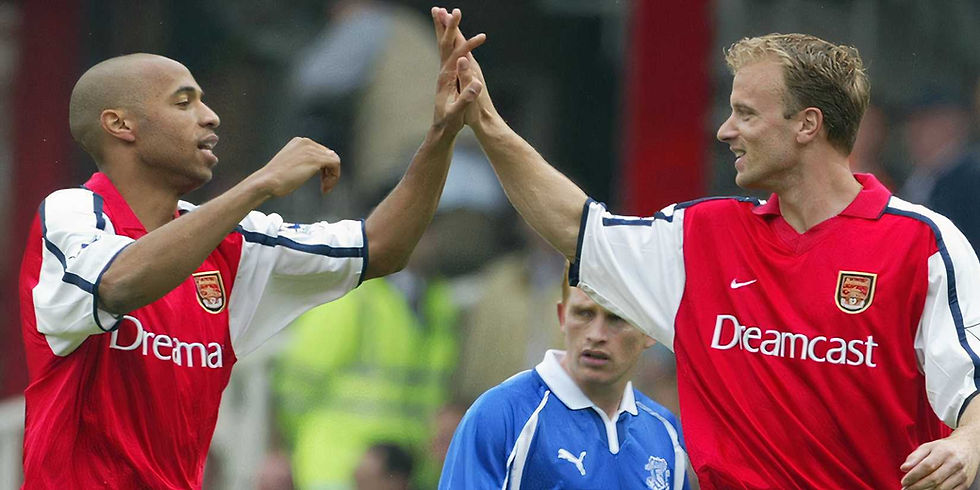
In the later years of Arsène Wenger his career as manager of the first team of Arsenal, a group of data analysts was hired to see if they could improve the performance of the team. Wenger had a very talented bunch of players, but they all felt that they've should have been higher in the rankings, possibly even on the number one spot. Back then, data analysis was making its way into sports more and more, but Arsenal was still very much ahead in this field. So, they investigated.
After analyzing a large number of games they concluded that - unsurprisingly - more goals were scored in the opponents penalty box than outside of it. It was a bit of a 'duh' moment but there is a big twist coming... In the summer break the team got to work on making more and faster combinations, keeping the ball low, passing frequently all the way into the box. A sound strategy if there ever was one. Yet, that following season, even though ball and players reached the box more than ever before... they scored less.
No one understood. Passing and combining until you're in the box, close to the goal, with clear shots at it... that's the best way to play the game isn't it? Then why, even when they were succeeding did they not score more? Or at least the same amount? How could it be less? The culprit was a crucial bit of data that was missed at first...
Fear.
Lesson 1. Recognize the emotion first
Football is as much a psychological game as it is a physical one. Those with confidence in their hearts make different choices on the pitch than those who are less confident. Those choices ultimately lead to a win or loss. And in the data, you can also see that often, when someone shoots outside the box, straight at the goal, even when they are not scoring... this is seen as an important display of confidence.
Do it enough times, and your opponent will start to develop doubt and anxiety. Especially I might add, the goalie. And their decision making starts to falter.
So, contrary to what the data analyst thought, and what seemed perfectly logical, it actually pays to shoot from outside the box first, before playing in it. It pays to play the emotion, whatever the data may suggest. Just so your opponent may already be slightly rattled by the time you arrive close to the goal.
Of course, this too was present in the data. It's just that nobody saw it, because no one bothered to look that deep. It took a bad season, with millions of pounds sterling lost, to figure that out.
So, yes, you've guessed it. Storytelling with data starts with emotional awareness. Just like every other form of storytelling does. First recognize the emotion, before you even begin thinking of the data itself. Why I am presenting this? What is the meaning, the goal? What is the emotion behind my data? And then lead with that.
Lesson 2. Functional data comes second... but played well, it'll give you a goal
The film Moneyball is based on the true story of coach Billy Beane played by Brad Pitt and fictional data analyst Peter Brand played by Jonah Hill (portraying, although somewhat inaccurately, the real life data analyst Paul DePodesta), who together figured out how to make a team of losers from Oakland Athletics, win the league.
Based on data alone.
Coach Beane had just a small amount of money for recruiting, Oakland being the lowest team in the league, meaning he would only be able to buy players that had low performance scores. Sifting through the data, analyst Brand (DePodesta in real life) came up with an ingenious solution: he picked out low performing players based on the one thing that they were good at. For instance, someone had low scores across the board except when they were guarding third base. Going forward, they would put these low performers on the pitch on that one spot (such as third base, etc.).
It brought them the league win.
In this case, what we can learn is to communicate the cleverness and insight of your data. Make sure that this is abundantly clear in your story.
Lesson 3. Use the narrative arc
A scientific paper starts with describing a status quo, before quickly introducing the research question. It then builds through all the steps of research that either prove or disprove the research goal. It ends with the final conclusion, before suggesting the next research step coming from the new-found status quo.
This represents the same basis steps as the narrative arc in storytelling. The story starts with the status quo, then an inciting incident happens that challenges and changes the status quo. Then, through a series of rising points of 'conflict' (friction in the narrative sense) it builds up to a climax or finale, before ending in a new-found status quo. As you can see, the two are alike.
When presenting data you can use the same technique. First you present what the situation was before. Then you emphasize the moment your data collection starts, or takes a significant turn towards the insights you wish to present. Then you go through the key highlights, build up to the ultimate insight (the finale) and then present the new-found status quo, and possible next steps afterward.
Make it a journey, with key moments emphasized, build up to a finale of insight.
Lesson 4. Communicate the 'Why' as if your life depended on it
Climate scientists usually don't understand why so few people - most of all leaders - take the appropriate steps combating global warming. To them the data shows clearly we are in trouble. So, why is everybody taking so god-damn long to react?
The answer is again, emotion. Or rather more specific, the lack of it. A human being who is not on a career path in the sciences or green movements has plenty of other things to do in life, often involving taking care of loved ones and the many, many other challenges there are in life. And leaders have to juggle many other challenges than climate change alone, some of them very acute.
Of course most of these people will want to do the right thing when it comes to climate change. But it is just not top of mind. The only way to change that is to make a superior emotional connection.
As a scientist, you have the obligation to try and make an emotional connection even if the data already speaks for itself. Or to put it more scientifically: the human species is a social animal, driven by emotion first. As such, the scientific answer to the conundrum is to create the emotional connection. Just think of your own emotion of 'irritation with the rest of the world' when they don't spring into action fast enough.
See what I did there? You too are engaged by emotions. Not by data alone. A scientist too, is human. And thus, emotional. So, why would they be excused from trying to make an emotional connection first? Just like everybody else needs to do?
Now, if you're on board with this, the next question becomes 'how'. The 'how' in this case is actually clearly communicating the 'why' and making sure it's importance is understood. That's the lesson. Data that may look slightly 'flat' at first glance. But it becomes a whole lot more interesting fast when people feel the urgency to understand it. Make sure you communicate its urgency in a humane manner (so, no wagging fingers... ;).
Lesson 5. Make it deeply personally relevant
There is a general rule of thumb in all communications: the bigger the subject, the further away it feels, so the more important it becomes to make it personally relevant. In many professions that deal with data frequently, the numbers are about large subjects: amounts of people with a disease, financial numbers of a large international corporation, shipping lanes in a crisis, marketing numbers that reflect huge amounts of engagement online, global warming trends...
You're catching my drift: the data that analysts need to present is often of very high significance. Interpreting it right and understanding its trends can mean the difference between success and failure, just as it did with our Arsenal example, or even life and death. The problem is that data at such large scales can feel very distant, very 'far away' from the personal world of the receiver of your data-story. What helps tremendously is when you make it personally relevant.
This sounds hard... but it's a lot easier than you'd think. For instance, say you are presenting the marketing data on awareness, click-ratios, conversion and sales on a product online. It is very likely you will already give a detailed - or in a better word deep - analysis. Often, the only thing you'd have to add to that is translating it through to what it would mean for the department that the receiver works at. It could be as simple as one extra slide, or a couple of extra sentences, or even just a question that is relevant to that specific department or person's job.
The key insight here is that data-presenters often don't (like to?) make that last step into what it means in practice, on a personal job-related level, because they don't 'want to impose'. As such, they hesitate. This however, is actually the worst thing you can do. You should never hesitate because presenting the personally relevant touch, will be exactly the point where new, and more successful actions are made. It's the point you want to reach with your data!
Lesson 6. Audiovisual presentation
There are key things to understand about the art of presenting that I recommend you look into. I'm not the expert on the theory but I have given hundreds of presentations myself and have learned in the field, with plenty of tips to give, with the following three the most basic ones.
First, always dress up. It's not about how you feel in those clothes, but not dressing up signals the audience that you don't care about them. The act of dressing up is about communicating to the audience that they are worth to dress up for. No sneakers. No jeans. Only the suit, or something similar, counts. They'll never tell you. But subconsciously and consciously, the receiver sees it as an insult if you don't. That too, is part of understanding the emotion of your storytelling.
Second, be there in time. For the same reason: show the audience you care enough to make sure you are there in time. For them.
And third, audiovisuals matter. Showing very small numbers on a screen will get you nowhere. Highlight important numbers. Make the visuals attractive. Use photography... you're getting what I'm getting at. Again, show your audience you care enough about them to make it look good.
And while we are on the subject of showing respect to the audience...
Lesson 7. Screw AI. Let them ask You.
... using AI generated things communicates disrespect. It tells the receiver you'd rather have the computer crunch it out while you watch TV, instead of putting time and effort into teaching your audience. It is, in short, another form of insult.
Artificial intelligence is artificial. And as such, risks creating an even bigger gap with your audience than data already has: the human, emotional gulf. AI brings with it the illusion of control, not actual control. Of course, I immediately understand that with data analysis, the AI-agents can be extremely helpful with the data crunching and fast analysis. It's okay if the data is based on some AI crunching of course! But when you show your data, when you tell the story of the data, make sure it is you that people are focused on. Because just like in our Arsenal example, it is the human, emotional factor that determines success and failure.
So, screw AI. Let them ask you.
Be confident - Your data matters more than you know
My final note is on your confidence level and creative energy. We live in a complex, competitive world that is often linked across numerous different data points. Understanding the data is more important than ever, on many many levels.
The right presentation of data can help clear shipping lanes in times of crisis, combat climate change, be the difference between profit and loss for thousands of people, can save lives in medical professions... and so on and so forth.
My point is, don't forget that. Your data deserves the best story it can have.
Love, as always,
Rogier
And check out my book The Whole Story - The Ultimate Guide to Storytelling!


